How data can supercharge your storytelling
Apple may be winning its court case with Epic, but the App Store is taking a beating in the court of public opinion.
Earlier this week, though, Apple public relations fought back with a release detailing the company’s efforts to protect users and prevent fraud.
And Apple did so with plenty of data: large and sweeping numbers that help readers understand both the scale of the App Store and the company’s fraud prevention efforts:
… with 1.8 million apps on the App Store
… In 2020, the App Review team rejected over 215,000 apps
… In 2020, the team assisted more than 180,000 new developers in launching apps.
How can data help you support your PR position?
Let’s look at a few techniques Apple used—and some it could have used.
Use graphics
Apple opens the release with this simple graphic:
It quickly conveys a sense that the App Store is secure.
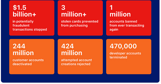
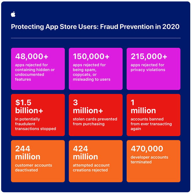
Then Apple packaged up many of its fraud prevention statistics into an infographic:
But Apple doesn’t leave the data hanging; the rest of the release supports the infographic with context.
Know your audience
The Apple Newsroom grapples with a constant challenge: it has a huge audience with varying degrees of market and technical knowledge.
And so the release has to avoid getting overly technical. Writers can’t make an assumption that the reader has deep knowledge about the App Store, the app marketplace, or Apple’s operations. It has to tell the story from the ground up.
For example, Apple gives a specific explanation of the kinds of apps it removes as part of its review process:
In just the last few months, for example, Apple has rejected or removed apps that switched functionality after initial review to become real-money gambling apps, predatory loan issuers, and pornography hubs; used in-game signals to facilitate drug purchasing; and rewarded users for broadcasting illicit and pornographic content via video chat.
In one sentence, Apple builds the reader’s knowledge of the kinds of fraud the company seeks out and prevents.
Pair big numbers with small stories
We don’t relate to data; we relate to data in the context of people and stories. Apple did not feature a particular developer who prospered in the store, or tell the story of an individual who was protected from fraud. The company missed an opportunity to make the data more relatable through emotions readers can feel and empathize with. With huge numbers, small examples bring data points to life by grounding them in stories we can relate to on an individual level.
Use comparisons
Comparisons can help readers understand both scale and context. Apple missed opportunities with its data to make comparisons.
For example: Apple claims it prevented more than $1.5 billion in fraudulent charges in 2020. According to Julie Conroy, a research director for Aite Group’s fraud and anti-money laundering practice, US credit card fraud in 2020 equaled nearly $11 billion dollars.
So Apple could have said something like this:
In 2020, our efforts prevented fraud that would have equated to more than 10% of all credit card fraud in the United States.
Comparisons and context help us better grasp large numbers.
Data isn’t a substitute for effective storytelling—it’s a spice
Data brings scale and specificity to the positions we try to support. But data is not a substitute for clear explanations, relatable stories, and vivid comparisons. The tenants of interesting and effective storytelling always matter. The right data just makes our stories more lively, interesting, and persuasive.


